CSS Masonry
Note: This article was translated from Chinese to English by Claude AI (Anthropic).
The Debate Around Masonry
Recently, the WebKit team published an article titled Help us invent CSS Grid Level 3, aka “Masonry” layout, discussing the proposal for Masonry layout.
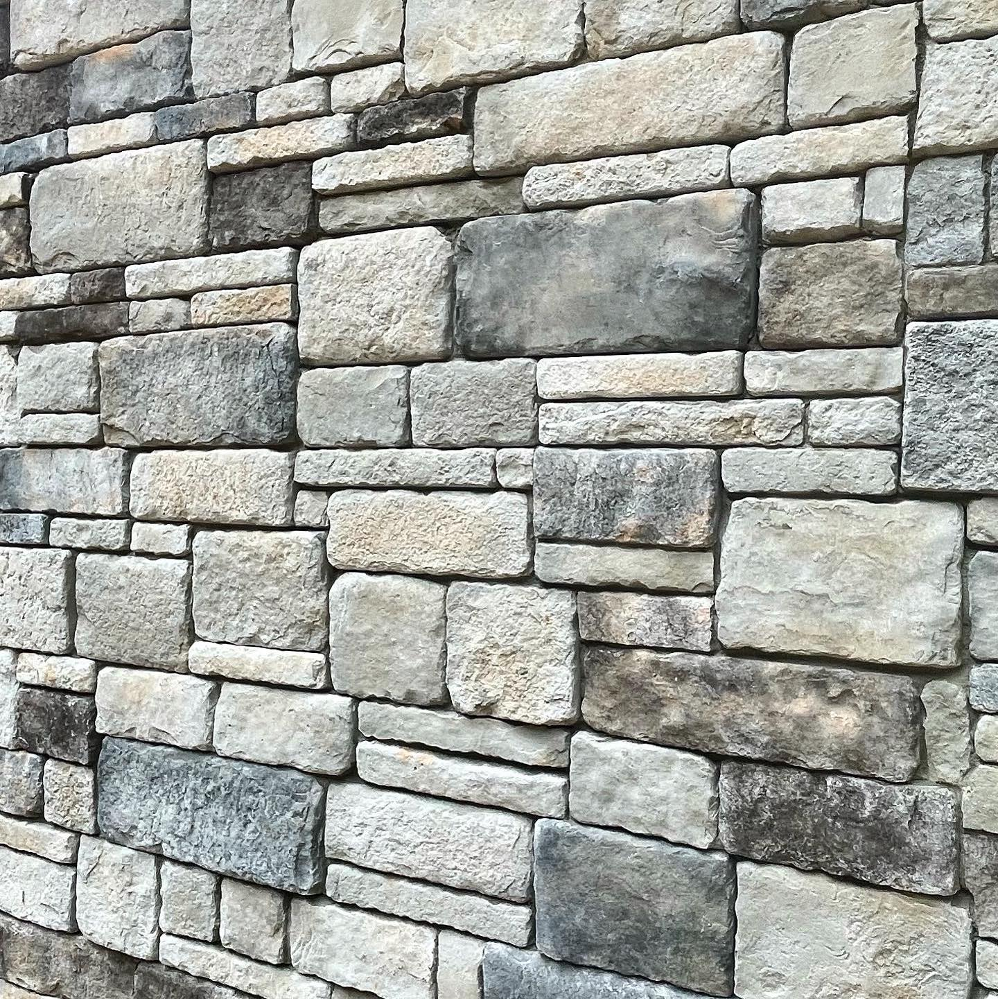
Masonry refers to the stonework of buildings (as shown below).

Masonry layout is a pattern similar to brick or stone walls, commonly known as waterfall layout. This layout style is very common, used by sites like Pinterest and Xiaohongshu.

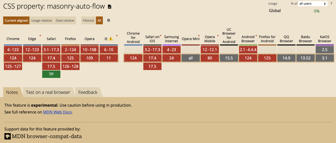
Masonry was initially proposed by the WebKit team, and you can find its usage on MDN (currently only supported by Safari and Firefox browsers). In WebKit’s article, they explained why they believe Masonry should be part of CSS Grid, discussed the feasibility of using an alternative display: masonry approach if adopted by the CSS Working Group, and sought advice from developers and designers.
The Chrome team recently responded with an article titled An alternative proposal for CSS masonry, explicitly stating that “implementing it as a part of the CSS Grid specification [..] would be a mistake”.
How to Use Masonry
Although waterfall layouts are common, I’ve never written one as a frontend engineer. Let’s take this opportunity to create a waterfall page using this new layout.
First, let’s create an HTML file and add some images for the waterfall layout.
<div class="gallery-container">
  <figure>
    <img src="https://picsum.photos/seed/1715619706392/500/500">
  </figure>
  <figure>
    <img src="https://picsum.photos/seed/1715619668573/500/1000">
  </figure>
  <figure>
    <img src="https://picsum.photos/seed/1715619707240/500/500">
  </figure>
  <figure>
    <img src="https://picsum.photos/seed/1715619669966/500/1000">
  </figure>
  <figure>
    <img src="https://picsum.photos/seed/1715619687217/500/800">
  </figure>
  <figure>
    <img src="https://picsum.photos/seed/1715619713060/500/500">
  </figure>
</div>
Then add CSS, using grid-template-rows: masonry to create the waterfall layout.
img {
  width: 500px;
  object-fit: contain;
  border-radius: 15px;
}

.gallery-container {
  display: grid;
  grid-template-columns: repeat(3, 1fr);
  grid-gap: 1rem;
  grid-template-rows: masonry;
}
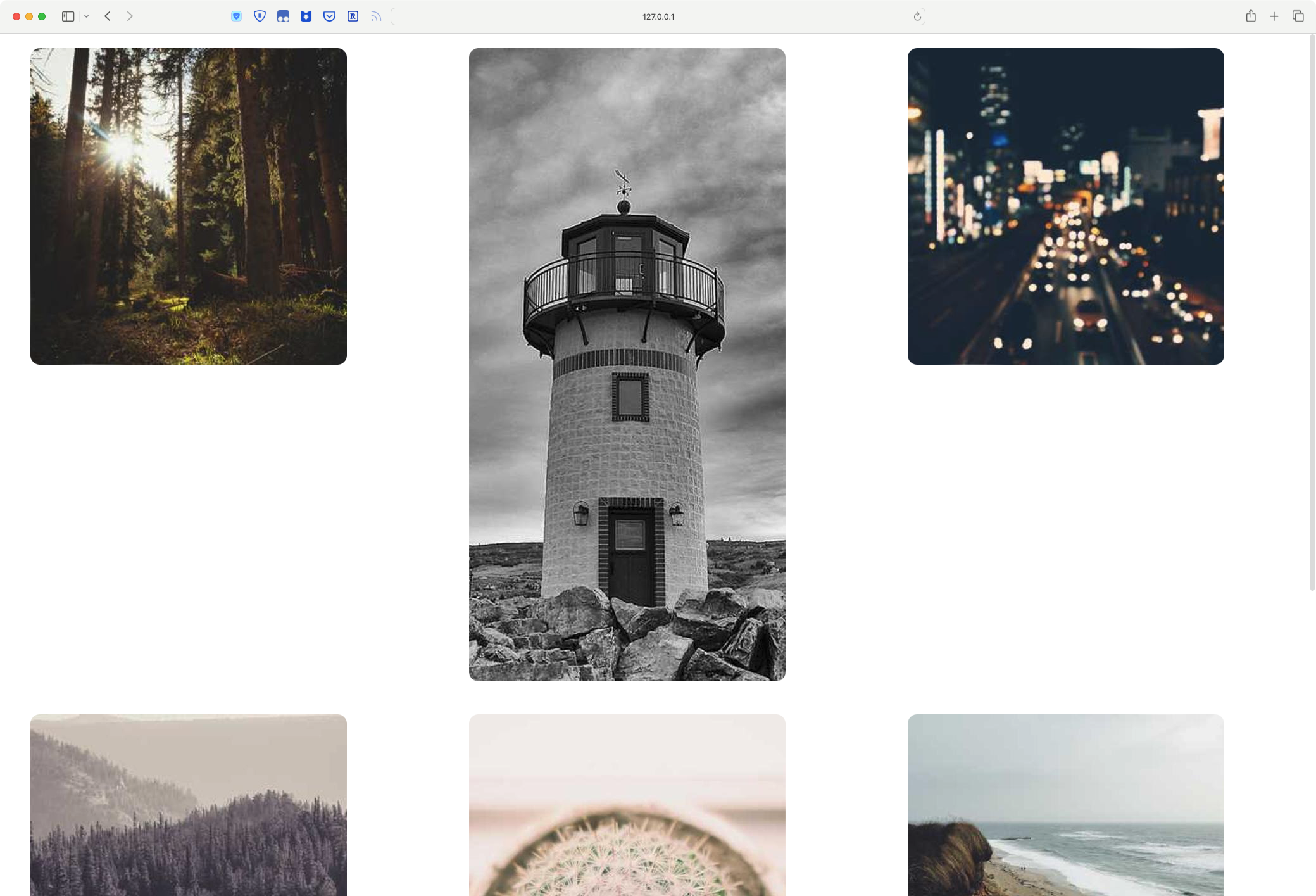
We can see that while the grid layout works, grid-template-rows: masonry doesn’t take effect, leaving large gaps between images.

This is because Masonry is currently an experimental feature, unsupported by most browsers. You can download Safari Technology Preview or Firefox Nightly to try this new feature.

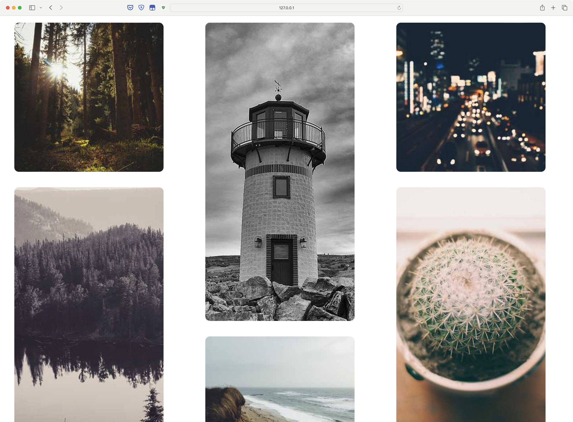
I’m using Safari TP, and as shown below, a simple waterfall layout is achieved.

Thanks to masonry, the entire implementation is very simple. Here’s the complete code: waterfall-demo
My Opinion
When first using this new feature, some aspects were confusing.
First, as a non-native English speaker, the word “masonry” is very unfamiliar, unlike common CSS terms like border, center, none which are self-explanatory. There’s a language barrier.
Second, using grid-template-columns/grid-template-rows with masonry goes against my intuition. Simply put, to achieve a vertical waterfall flow, you need to use grid-template-rows: masonry, while I instinctively thought it would be grid-template-columns. It’s similar to how a Windows user might initially struggle with scrolling on macOS.
To summarize, I have two suggestions for Masonry:
- Replace the word “masonry” with the more intuitive “waterfall”
- Like the Chrome team’s view,
Masonryshouldn’t be part ofGrid, but should be used independently asdisplay: masonry.