围绕 Masonry 展开的辩论
前段时间,WebKit 团队发表了一篇名为 Help us invent CSS Grid Level 3, aka “Masonry” layout 的文章,讨论了关于 Masonry layout 的提案。
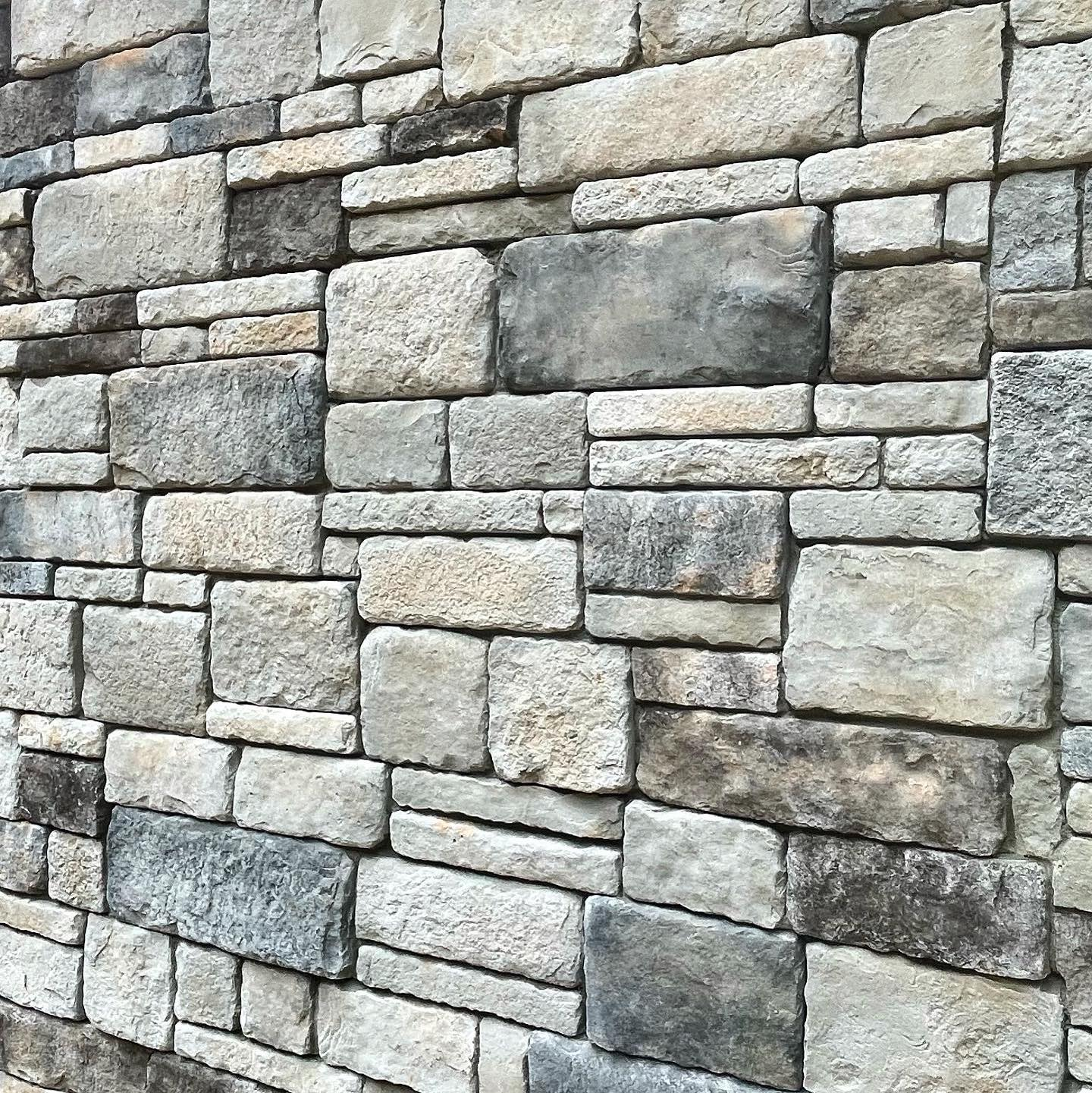
Masonry 在英文中的意思是建筑物的砖石部分(如下图)。
masonry 布局是一种类似砖墙或石墙的模式的布局,也就是我们常说的瀑布流布局,这种布局样式很常见,比如 Pinterest 、小红书等都采用了这种样式。

Masonry 是最开始也是由 WebKit 团队提出的,你可以在 MDN 上查看到它的使用方法(现在只有 Safari 和 Firefox 浏览器支持)。而在 WebKit 发表的这篇文章中,他们解释了为什么他们认为 Masonry 应该成为 CSS Grid 的一部分,并且解释了如果 CSS Working Group 使用替换方案 display: masonry 的可行性,并且向开发者、设计师寻求建议。
Chrome 团队也在前几日站出来,发表了一篇名为 An alternative proposal for CSS masonry 的文章,关于 CSS Masonry,他们明确的提出了 “implementing it as a part of the CSS Grid specification [..] would be a mistake"(将其作为 CSS Grid 规范的一部分是个错误)的观点。
Masonry 怎么用
虽然瀑布流很常见,但是作为一名前端工程师,我还从未写过这种样式,趁热打铁,就用这个新布局来写一个瀑布流页面。
首先我们建一个 html 文件,添加一些图片做瀑布流使用。
<div class="gallery-container">
  <figure>
    <img src="https://picsum.photos/seed/1715619706392/500/500">
  </figure>
  <figure>
    <img src="https://picsum.photos/seed/1715619668573/500/1000">
  </figure>
  <figure>
    <img src="https://picsum.photos/seed/1715619707240/500/500">
  </figure>
  <figure>
    <img src="https://picsum.photos/seed/1715619669966/500/1000">
  </figure>
  <figure>
    <img src="https://picsum.photos/seed/1715619687217/500/800">
  </figure>
  <figure>
    <img src="https://picsum.photos/seed/1715619713060/500/500">
  </figure>
</div>
然后写入 CSS,通过 grid-template-rows: masonry 来实现瀑布流布局。
img {
  width: 500px;
  object-fit: contain;
  border-radius: 15px;
}

.gallery-container {
  display: grid;
  grid-template-columns: repeat(3, 1fr);
  grid-gap: 1rem;
  grid-template-rows: masonry;
}
我们可以看到,虽然 grid 布局生效了,但 grid-template-rows: masonry 并未生效,图与图之间存在大片的空白。
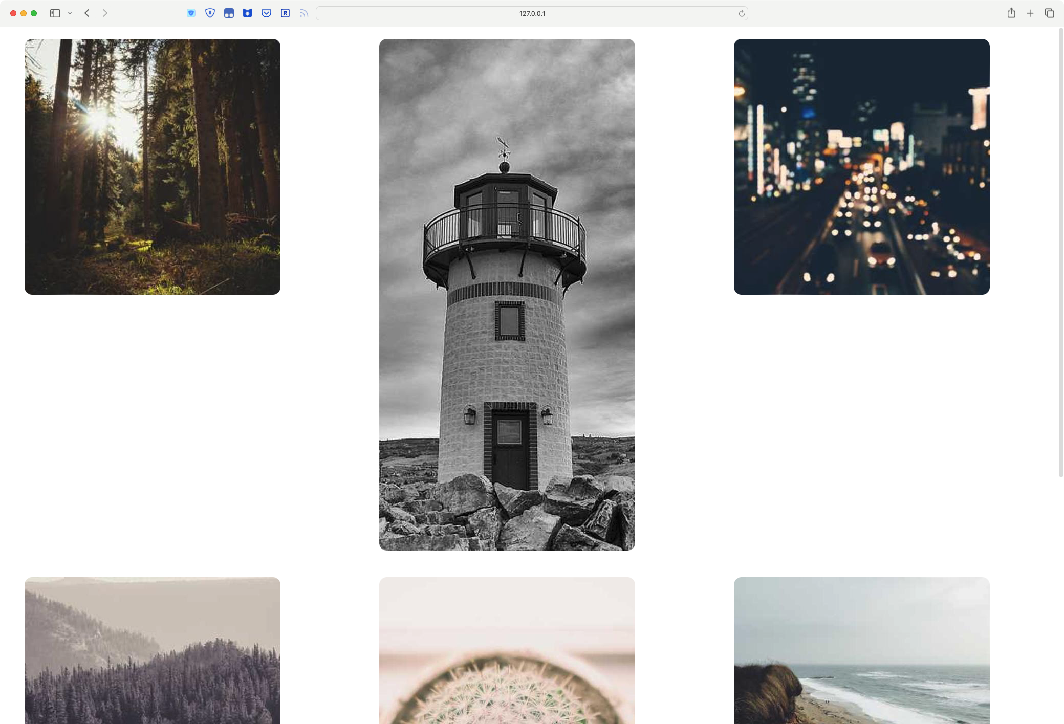
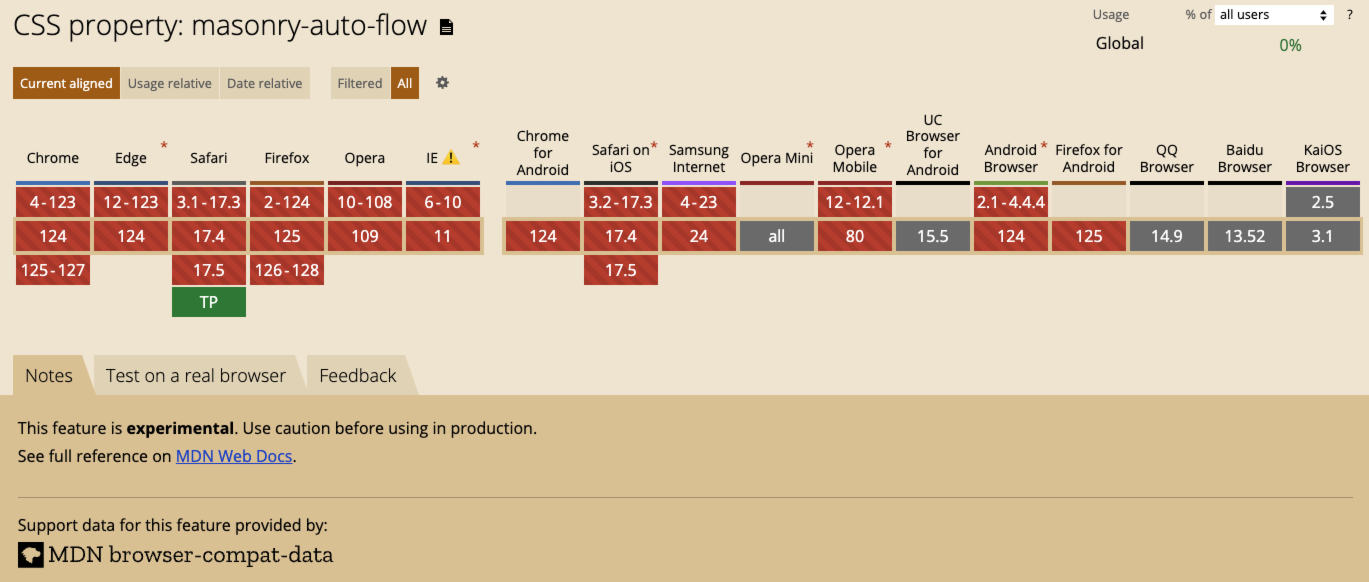
这是因为 Masonry 目前只是个实验性功能,大部分浏览器还不支持,你可以下载 Safari Technology Preview 或者 Firefox Nightly 来体验这个新特性。
我使用的是 safari tp,如下图所示,一个简单的瀑布流就实现了。
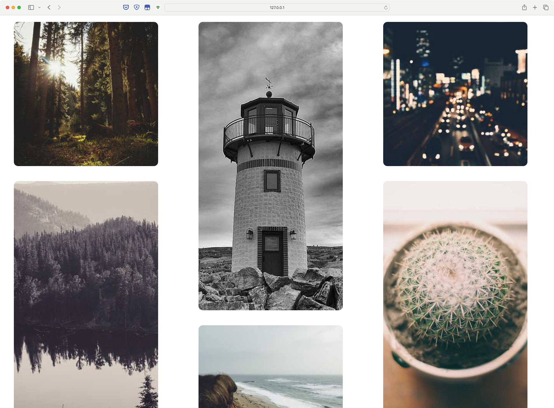
得益于 masonry,整个实现过程非常简单。附上完整代码:waterfall-demo
我的观点
首次使用这个新功能的时候,有些地方是很迷惑的。
首先,作为一个 nonnative English speaker,masonry 这个词对我来说非常陌生,并不像 CSS 中常见的 border、center、none 让人一目了然,是有语言门槛的。
其次,对于 grid-template-columns/grid-template-rows 搭配 masonry 使用,与我的思维习惯相悖,简单来说就是,要想实现纵向的瀑布流,需要使用 grid-template-rows: masonry,而我潜意识认为是 grid-template-columns。这里有点像一个习惯使用 windows 的人,第一次用 macos 浏览网页对于上下滚动的无所适从。
总结一下,我对 Masonry 的建议有两点:
- 将 masonry 这个单词换成更容易理解的 waterfall
- 和 chrome 团队的观点一样,
Masonry不应该是Grid的一部分,应该单独的使用 ——display: masonry。